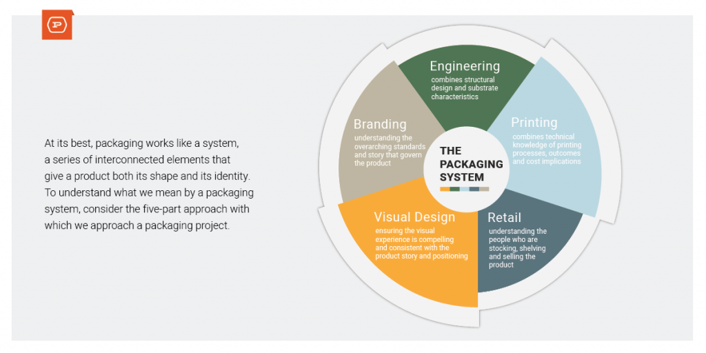
At the most basic level, packaging serves two purposes. First, it must protect a product, both in transit to the retailer and the consumer. Assuming it does this first task well, packaging must also communicate what a product is and does. These two priorities may seem straightforward, but packaging is more complex. At its best, packaging works like a system, a series of interconnected elements that give a product its shape and identity.
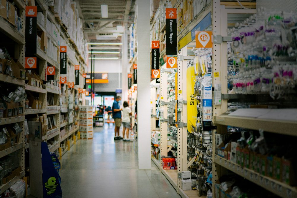
Retail shelves are full of packaging that checks the boxes. There’s a container and a label – check and check. Not only does this packaging look like an afterthought, it’s also not the best use of resources. Packaging doesn’t have to be expensive to be successful. However, it does need to be intentional, and it absolutely must make sense. To understand what we mean by a packaging system, consider the way we approach a packaging project.

By focusing on packaging as a system we can create fully optimized packaging that consumers identify with and support brand values and positioning. We create packaging as an asset rather than packaging as a cost.
Branding: Relating Packaging to Positioning
When trying to determine the type of packaging that is right for your product, start with your brand positioning. Positioning is both your start and finish line in the packaging process. For a product that is an inexpensive OPP (opening price point) item, the packaging should reinforce that. Mind you, packaging can speak to economy without looking cheap. More so, premium products must have packaging that creates confidence in pricing.
Between the two ends of the positioning spectrum are a multitude of variables, such as structure, materials and imagery, all of which can be leveraged in creative, intentional ways that support a product’s value. Take a look at our recent article, The Relationship Between Packaging & Positioning and How to Make the Most of It to see how seemingly minute choices can make a big difference in the way a product is perceived. The key is to have clear positioning at the outset of the project and to circle back with samples in hand to make sure you’ve hit the mark.
Engineering and Printing: Designing a Physical Experience
Humans are visual creatures, which is why the form of your packaging is so important. Yet, ironically, this is the area that we see most often overlooked. The reason is simple: It’s easy and inexpensive to buy a ready-made container and call it a day. When structure is considered in terms of manufacturing, the easy answer always wins.
Such a decision overlooks the fact that structure is part of your brand experience. Structure manifests brand values by way of the tangible materials, shape and structural functionality. The print quality and execution matter too. We advocate for holistic packaging design, where structural, material and print decisions are part of the creative process. In doing so, we can fully assess the significance of the container to shopper motivation and evaluate such factors as shopper convenience, functionality, longevity and visual appeal.
Retail Design: Prioritizing Information to Communicate Quickly
In the busy, distracting retail environment, brands have only a few seconds to capture attention. We want to create packaging that uses that time wisely by prioritizing information and using a clear hierarchy. In addition to organizing information strategically, using a “less is more” philosophy makes it easy for shoppers to get the information they need quickly.
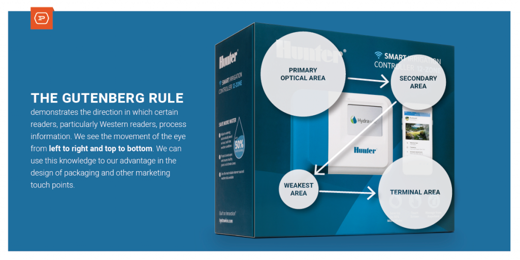
The Gutenberg Rule is a simple visualization that shows how Western readers have evolved to take in information. Users take in information moving left to right and top to bottom. Knowing this, we can be confident in where we place information. Likewise, we know how to prioritize information through size and positioning.

Visual Design: Using the Persuasive Power of Imagery
We’ve all heard that a picture is worth a thousand words. Well, that may be an understatement. The human brain has evolved to process entire images in as little as 13 milliseconds. We use imagery to process and understand concepts at a rate that is 60,000 times faster than text. In other words, imagery is an incredibly powerful tool with which brands can demonstrate and validate the effectiveness of their product. Imagery creates an emotional connection. And imagery comes in a variety of forms. From simple illustration to isolated product photography and environmental photography, each conveys a different story and a different position.
Branding: Balancing Creativity and Standardization
Last, but certainly not least, of best practices is ensuring brand consistency. Products that are part of a brand family are more credible and recognizable. All of the graphic elements that combine to create package design should be driven by brand standards. This includes brand colors, typography, logos/icons, photography styles and language. From the style of instructional icons to the layout of the primary display panel, all of it is inherited from the brand and must be carefully implemented.
Bonus: The Importance of Testing
Seeing is believing, which is why we are firm believers in mock-ups. Whether they are professionally produced 3D renderings printed to scale or simple craft models constructed in-house, there is no substitute for the reality check. As fervently as we advocate walking stores to experience the retail environment, we know that packaging requires all three dimensions as well. After all, shouldn’t the first hands to hold your product package be yours?
Each of these practices when carefully considered and well-executed will inform one another. They should work together to connect the dots between your product, your shopper and your brand. Such packaging makes sense. Such packaging is influential and powerful. It’s the first point of contact a shopper will have with your product. Make it count.